4 Key Benefits of a Clutter-Free Navigation on Your Real Estate Website

Many agents ask “Can I add unlimited pages?” and our answer is NO. Not because our Brixwork system cannot do it, but because we are firm believers in the “less is more” mantra. Too many navigation elements at the top of the page is overwhelming and confusing.
For small businesses, less navigation is best because it not only allows your potential clients to find what they are looking for quickly and easily, but also provides a friendly and enjoyable user experience.
. . . .
Key Benefits of a Simple Navigation

This is an example of a site with a cluttered and overcrowded main menu, an issue that can be resolved by the appropriate use of dropdown menus.

A beautifully simple and organized menu design from the website of our client Devon Owen.
1. Better Visual Appeal
Having less menu items at the top of your site allows for a clean and inviting appearance. If your potential clients can easily navigate through you site;s pages to find the information they need, there is a better chance of them spending more time on your site. People like it when information is categorized and organized. How crazy would a restaurant menu be if all of the dishes were listed without being split into appetizers, entrees and desserts? The importance becomes clear when you compare the following example to the menu design of our client Devon Owen’s website.
2. Better Niche Definition
Having clearly labeled menu items help people find information quicker. For example, if an agent has numerous sub areas that they specialize in, it may make more sense to have a listing page for each sub area, or separate pages for sold and featured listings. This will help to direct potential clients to the exact page they are looking for, rather than having them search through endless pages of listings for a property they want. When desired content can not be found quickly, people will be inclined to leave your site. Correct labelling is an important factor in decreasing clutter, and increasing the amount of time people spend on your site.
3. Dropdown menus make navigation easier and more logical
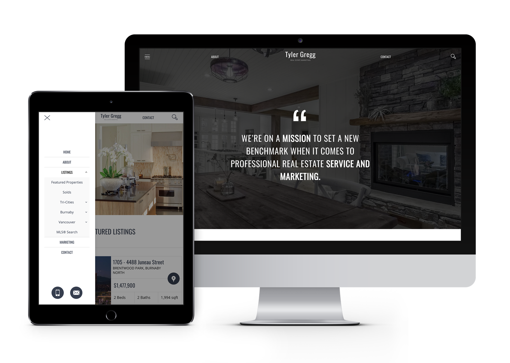
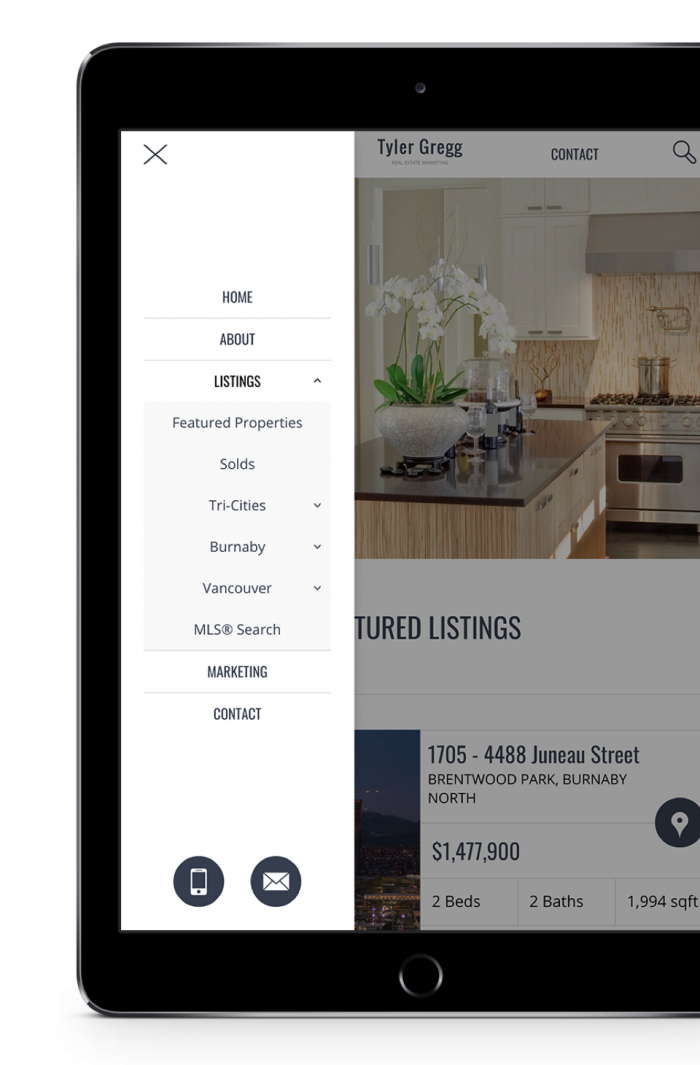
Dropdown menus are a better way to navigate through multiple pages, as it is groups them into categories to make them easier to find. Naming your main menu items correctly not only keeps your menu bar looking clean, but also provides your potential clients with easy access to specific pages, and seamless transitions to related pages. Imagine how easy it would be to find a specific property type on Tyler Gregg’s Real Estate website.

A mobile responsive, categorized and organized submenu on the site of our client Tyler Gregg

4. Most Page Views Happen on Listing Pages
Based on our analysis of The Most Popular Pages on a Real Estate Website, it is apparent that most page views occur on listing detail pages. Having too many resource and information pages can be a complete waste of time. Why fill your website with pages that your potential clients aren’t going to look at?


