Project Description
Erika Bishop (Tri-Cities Royal LePage Realtor®)
Branding, Web Design & Print/Stationery
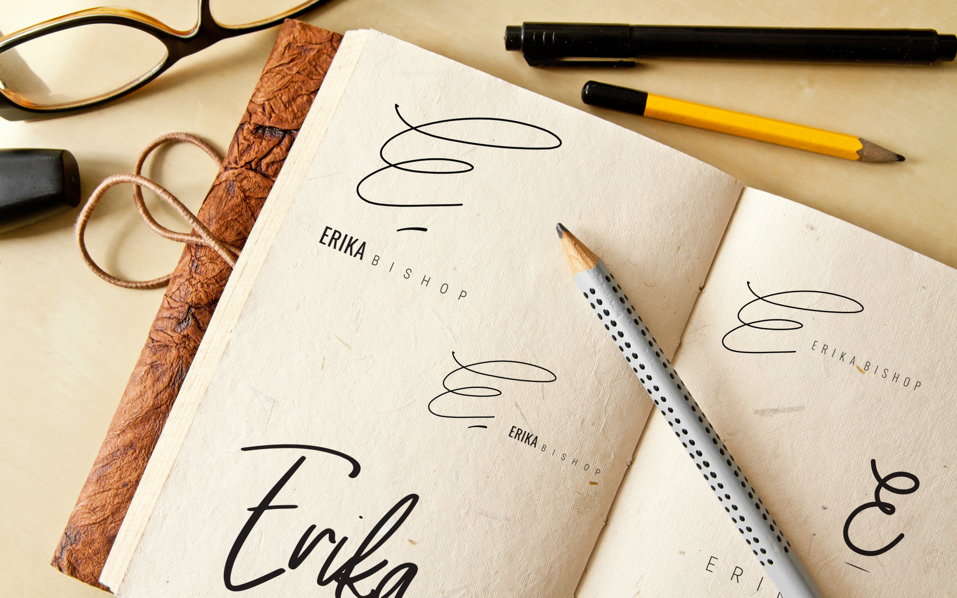
Hand-Lettered Branding Refined To Perfection
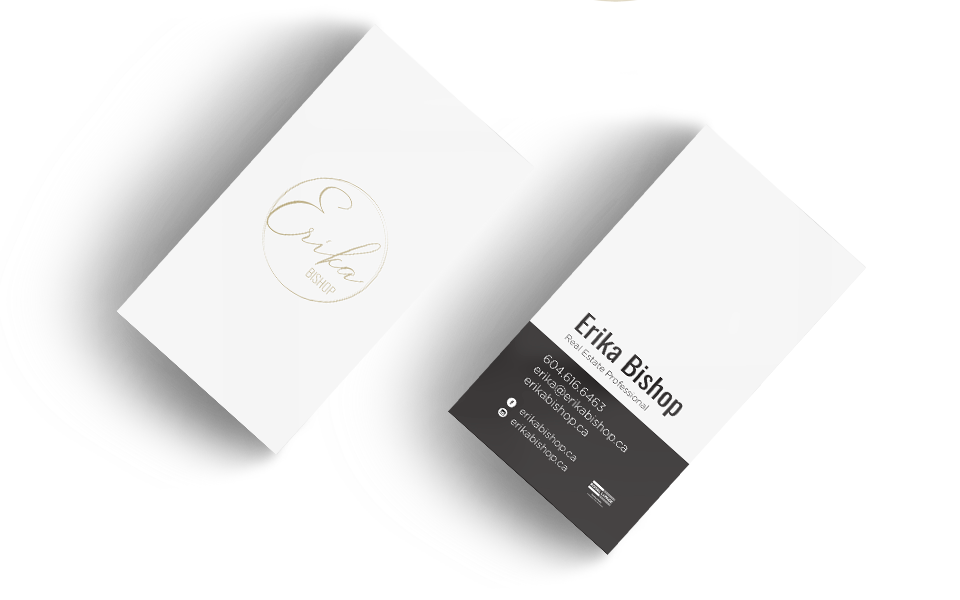
Erika’s custom crafted logo is as unique & memorable as she is as an energetic and capable real estate agent. The hand-sketched emblem showcases strength and flow as well as elegance in each stroke. The accompanying fonts and colours strengthen her presence even more as a Tri-Cities real estate agent.

Boutique Designed Semi-Custom Website
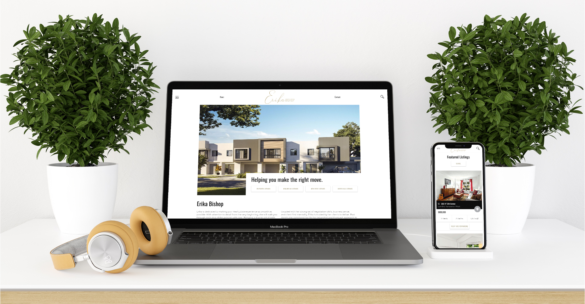
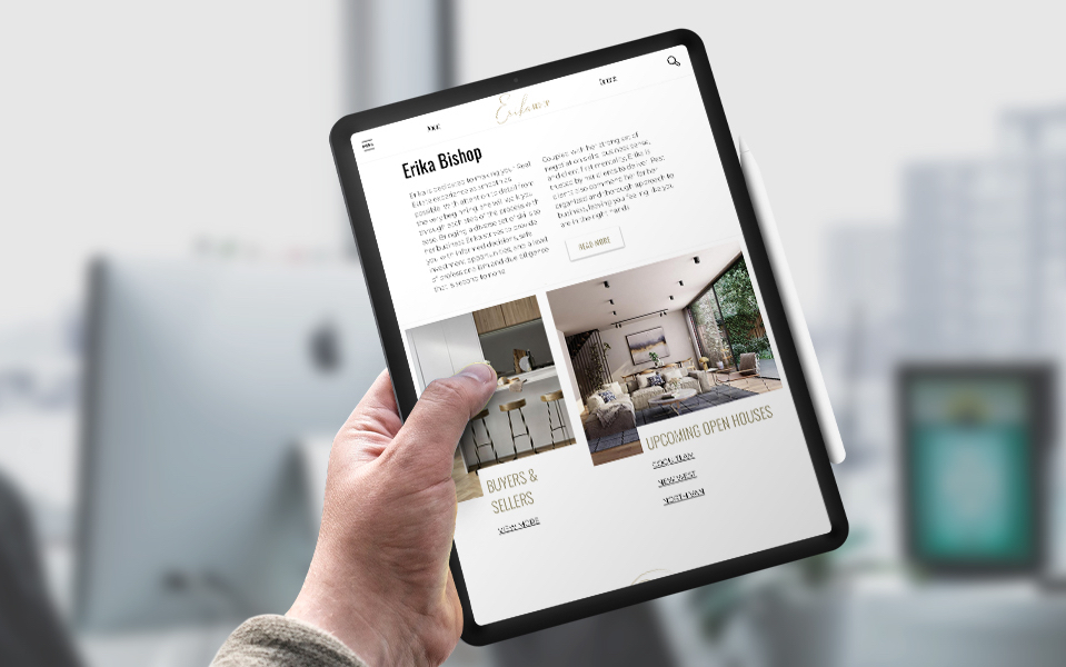
Erika’s Tri-Cities focused real estate website is designed with elegance and professionalism at its forefront. Erika’s homepage was customized to offer a clear & concise overview of her strengths as well as her niche speciality of the Lower Mainland region. The elegant colours & intelligent use of white space, as well as an intentional asymmetry in the layout are some highlights of this beautiful real estate website.


