Project Description
Selling Vancity
For Tina Yarn – Branding, Mobile Responsive Website
Branding
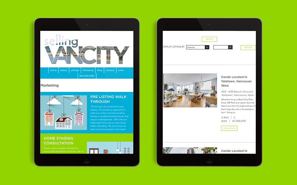
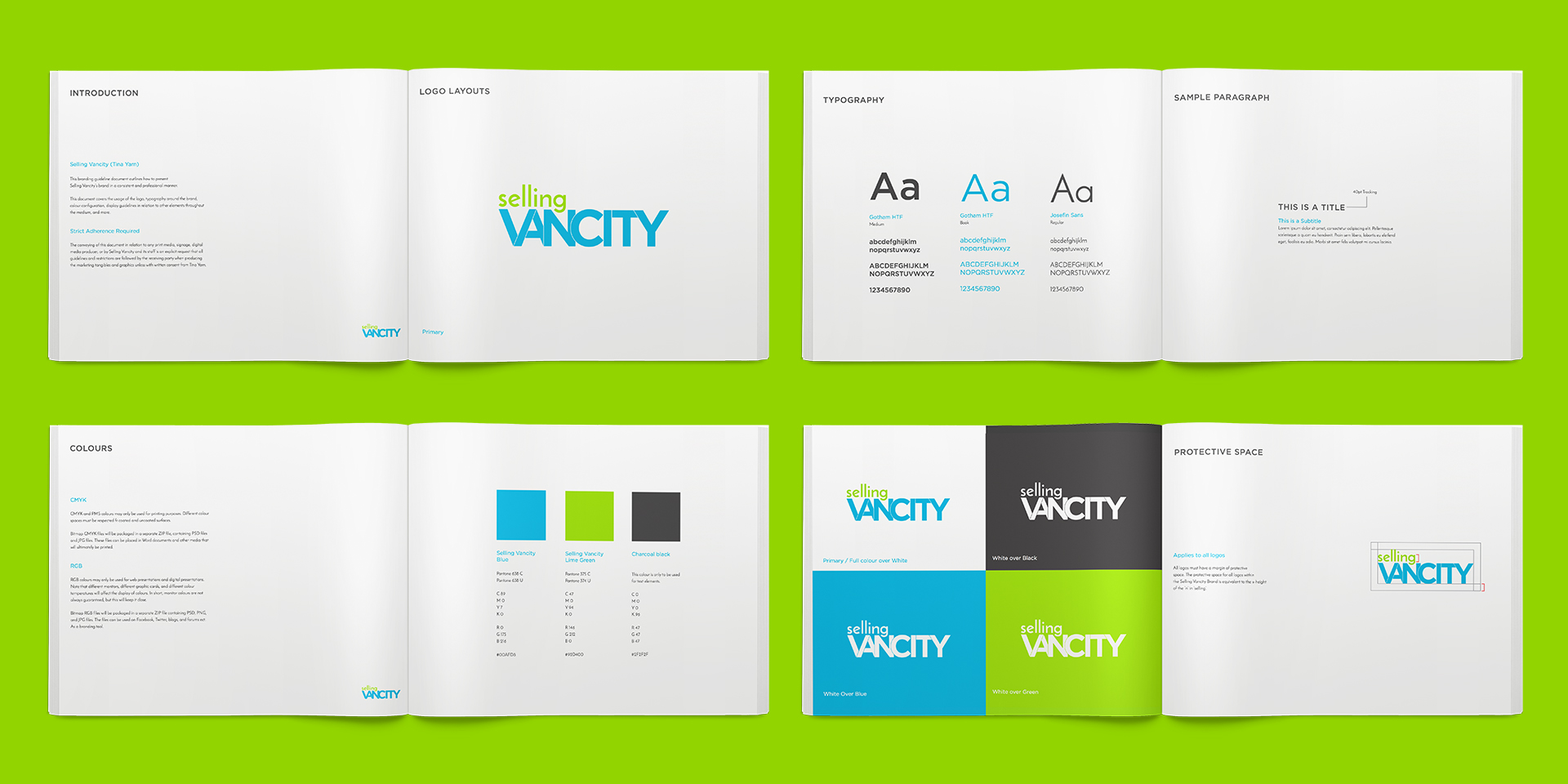
Tina wanted a brand that emphasizes her presence in the beautiful city of Vancouver – and she had already acquired a most attractive domain, www.SellingVancity.com. Revolving around this concept, we created a type-art brand that is not only beautiful but also versatile.
The primary colours chosen represent the spirit of Vancouver – a modern paradise with lush forest landscapes and the great Pacific ocean at its doorsteps, and that is the lifestyle that Tina helps her customers acquire and enjoy.
The Website
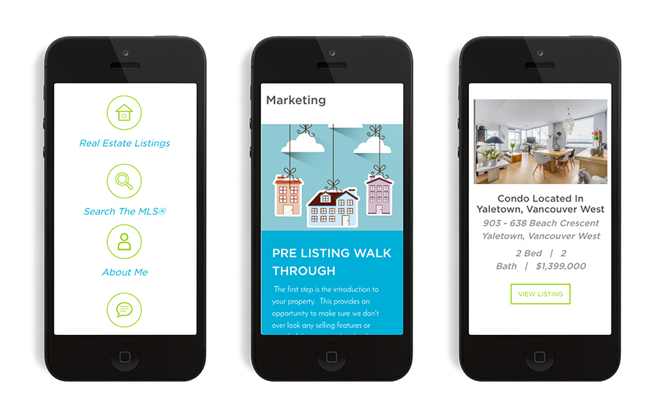
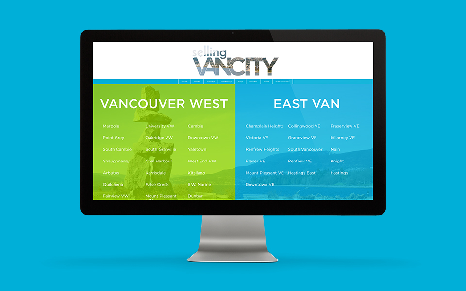
The branding was brought to life with a knockout of an aerial shot of Vancouver. Along with it we created one of the best and easiest city/subarea guides to help customers pinpoint their MLS® searches to the neighbourhoods they wanted.
The result was a website that had a perfect blend of jovial colours and user-friendliness – all that without looking overly complex or too busy. Digesting bright colours in a sophisticated and clean way was one of the most challenging yet most enjoyable part of this project.
