“It’s not that big of a chunk, let’s not worry about it for now.”
That was the answer from most people when discussing optimizing their websites for mobile devices few years ago. If you’re still thinking this, you are dead wrong, and here’s why.
Apple Sold More iPads In Q4 Than Any Single Manufacturer Sold PC Devices.. EVER
It’s true. Apple’s iPad sales in Q4 of 2011 alone have exceeded the number of PCs sold by any other competitors in the same quarter. This figure includes big names such as HP, Acer, Lenovo etc., and it shows the staggering growth of the mobile devices market. And let’s not forget the iPad isn’t the only mobile browsing device by Apple – there’s also the iPhone, which is selling at a record pace – in fact, as of January 2012, they figured out that there are more iPhones sold around the world per day than there are new babies born.
The new iPad, by the way, has some striking new features, such as a true retina display (a huge improvement from the iPad 2 from 2011), a much better camera, and 4G browsing speed! With 10 hours of battery life on the efficient-yet-fast A5X processor, most iPad users already prefer the iPad for emailing, browsing and much more, over their traditional computers. Yes, we are fans of Apple products here at Sonika Studios Inc. and BRIXWORK. In fact we operate our business on more than 50% Apple computers [The iPad on Apple.com].
What about other mobile devices such as smartphones?
iPads and iPhones are not the only ones in the market although they are easily the most dominant brand. The usage of smartphones in Canada saw the biggest growth between 2010 and 2011 – and that trend will only continue. Same goes for the USA – it is estimated that by 2015, just under half of Americans will be on smartphones. Smartphones, in case you are confused, includes all the cell phones that are now days more on the line of mini computers with the cellular phone function attached to it – this includes the Blackberry, Android devices, the Samsung Galaxy – you name it.
Ratio of Mobile Traffic to Our Customer’s Sites
Based on our Google Analytics data on BRIXWORK {real estate} sites, between 15% to 25% of visitors are viewing the sites on mobile devices. That’s significant – and on the rise ever yet. It is now critical to consumer websites to prepare for this surge of mobile traffic.
What is BRIXWORK and Sonika Studios Inc. going to do about this?
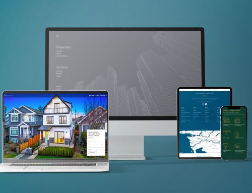
We already have done a lot, and we intend to do a lot more. Our websites are already mobile browser friendly by scrapping the usage of Adobe Flash (it’s been years, we lost count!), using standard-compliant coding structure, and avoiding the usage of plug-ins. We’re not done yet; we’re doing more! We are now offering real estate websites with a “responsive grid” system. This means that the website’s layout and structure will change depending on the size of the device from which your customers are visiting. Without over-stretching or over-squeezing, we are able to deliver scalable mobile adaptations at a very reasonable cost – far better than the traditional alternative of preparing a separate website codebase just for mobile visitors (I’m sure many of you noticed your browsers pointing towards m.facebook.com for example – Facebook has the cash to develop parallel sites for different devices, but it is not the case for neighbourhood Realtors®).
What about existing websites?
We are able to upgrade existing real estate websites for our customers to a responsive grid website for a modest cost. The cost will vary depending on your current design, and the time at which your design was done. Don’t worry; if your website was built after 2010, it is already mobile friendly (it just doesn’t have the new fancy responsive grid system). This is not a mandatory upgrade, but we are certainly happy to provide you with it.


